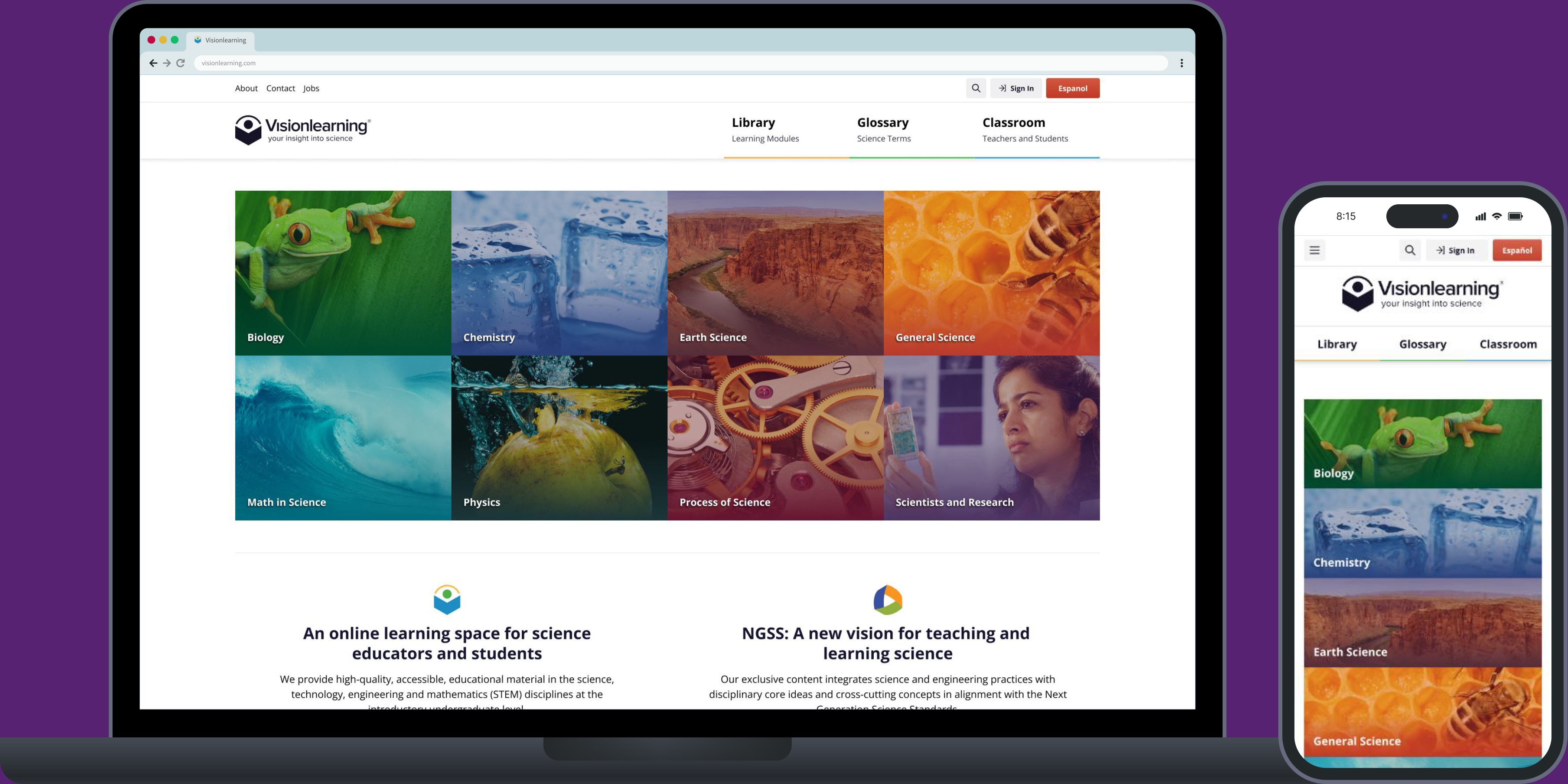
An award-winning S.T.E.M. learning space
Overview
Visionlearning is a free, online learning space for science educators and students. While their learning materials (available in English and Spanish) were valuable, The website wasn't responsive, and its outdated look didn't align with modern expectations. The initial ask was for a website resdesign. We proposed a complete rebrand to bring Visionlearning into the modern era of online learning.
Solution
Over multiple stages and releases, we transformed Visionlearning into a sleek, responsive, and accessible platform. We built a wealth of custom interactive features to support up-to-date accessibility requirements, and help Visionlearning align with Next Generation Science Standards.
Our key contributions included:
- Logo Design and Branding
- Interaction Design
- Front-end Development
- Scientific Figures and Illustrations
Execution
We started with a thorough audit of the existing website and learning materials. From there, we created a new sitemap with three main sections: Library, Glossary, and Classroom. We developed a color palette, assigning a specific color to each section. These colors were also incorporated into the new logo.
- Library#FBB451
- Glossary#53C65C
- Classroom#42A6D7
Logo Redesign
The new logo represents a student deeply engaged in learning and an observant eye, embodying Visionlearning's dedication to STEM education.
The Visionlearning logo
Interaction Design Strategy
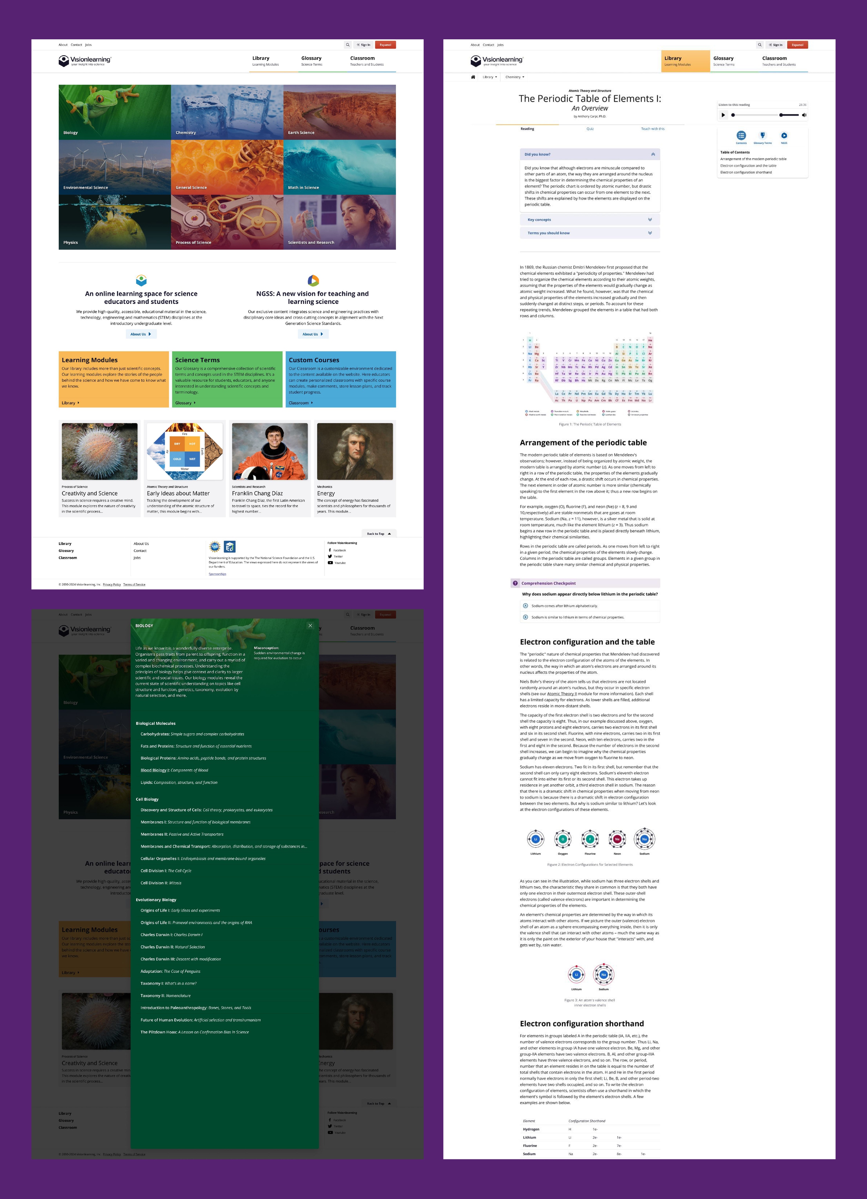
We developed a comprehensive design system with streamlined components, ensuring a consistent and simple design throughout. Our focus was on enhancing the learning experience with a clean and user-friendly interface. We created highly customizable interactions, especially within the learning modules, allowing users to engage with the content while staying focused on their learning.
Front-end Development
In the latest iteration, we leveraged the Natura11y Inclusive Framework (built by Carl). This framework allowed us to gain efficiencies and save time on the front end, enabling us to invest more in creating custom features that enhanced the overall user experience. We developed custom interactions and components with accessibility at the forefront of the design system, ensuring an inclusive and user-friendly experience for all users.
Reading Toggles
The reading toggles allow users to highlight glossary terms and Next Generation Science Standards (for teachers) within the module reading.
Glossary Terms
Activating the glossary toggle highlights glossary terms within the reading. Clicking on a glossary term opens the term's definition. The terms are cross-linked with the Glossary detail page.
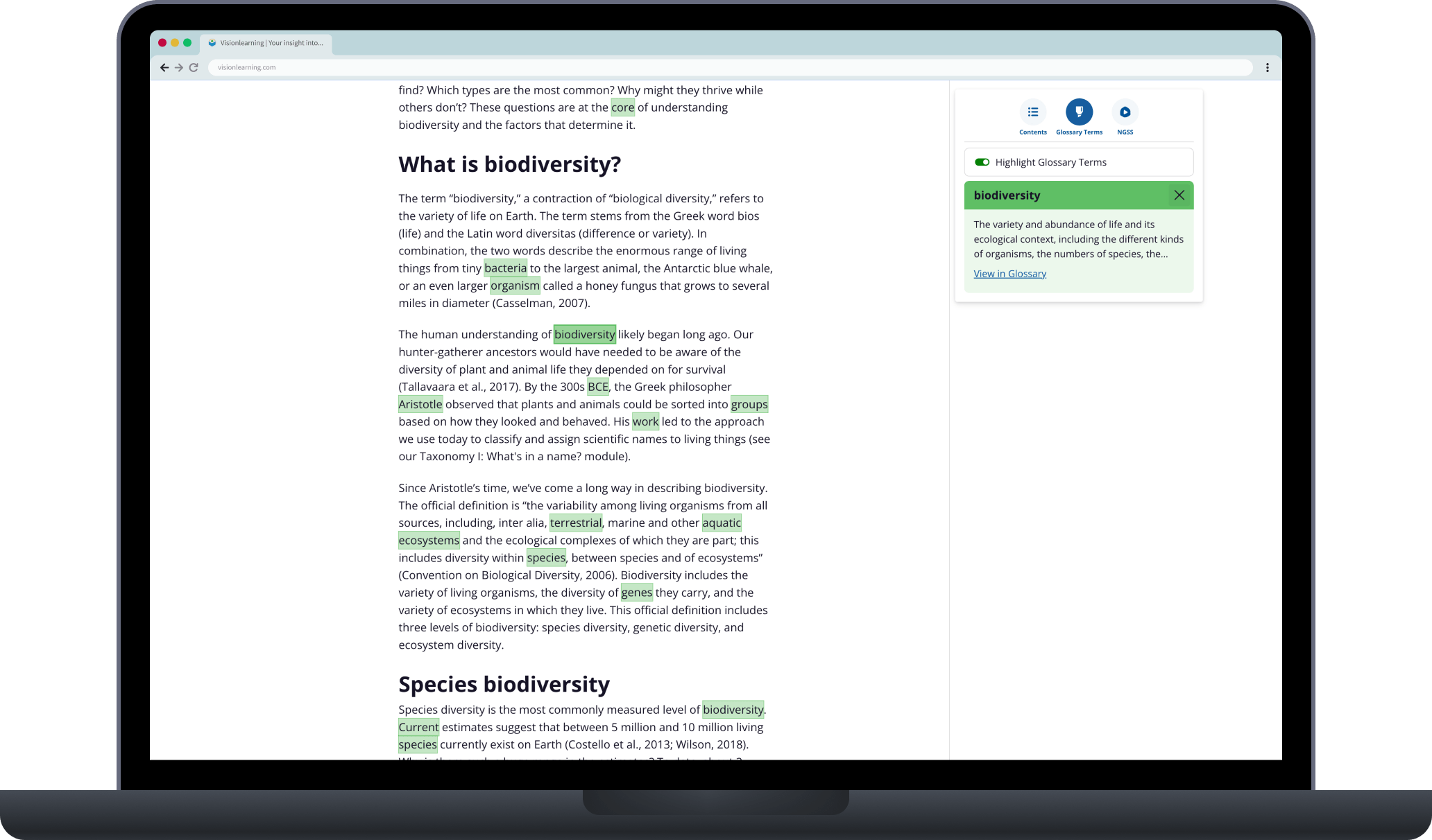
Example of the highlighted glossary terms with the module
Next Generation Science Standards (NGSS)
Activating the NGSS toggle highlights relevant annotations within the reading. Clicking on a standard opens its specification.
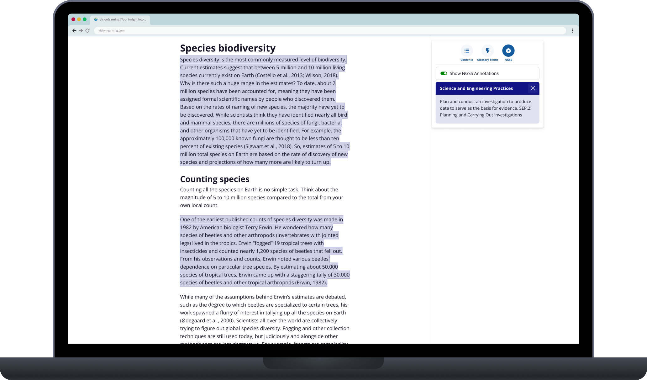
Example of the highlighted glossary terms with the module
Science Illustrations
We created custom scientific illustrations to add clarity to a variety of complex topics. The style depended on their placement and meaning within the content.
The complexity of these illustrations ranged from simple chemical formulas to visualizing the anatomy of plant and animal cells.
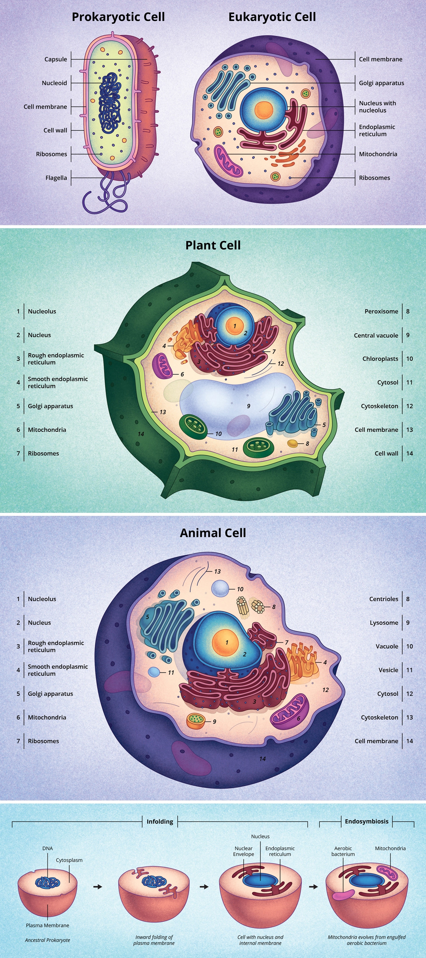
Illustrations created for 'Discovery and Structure of Cells'
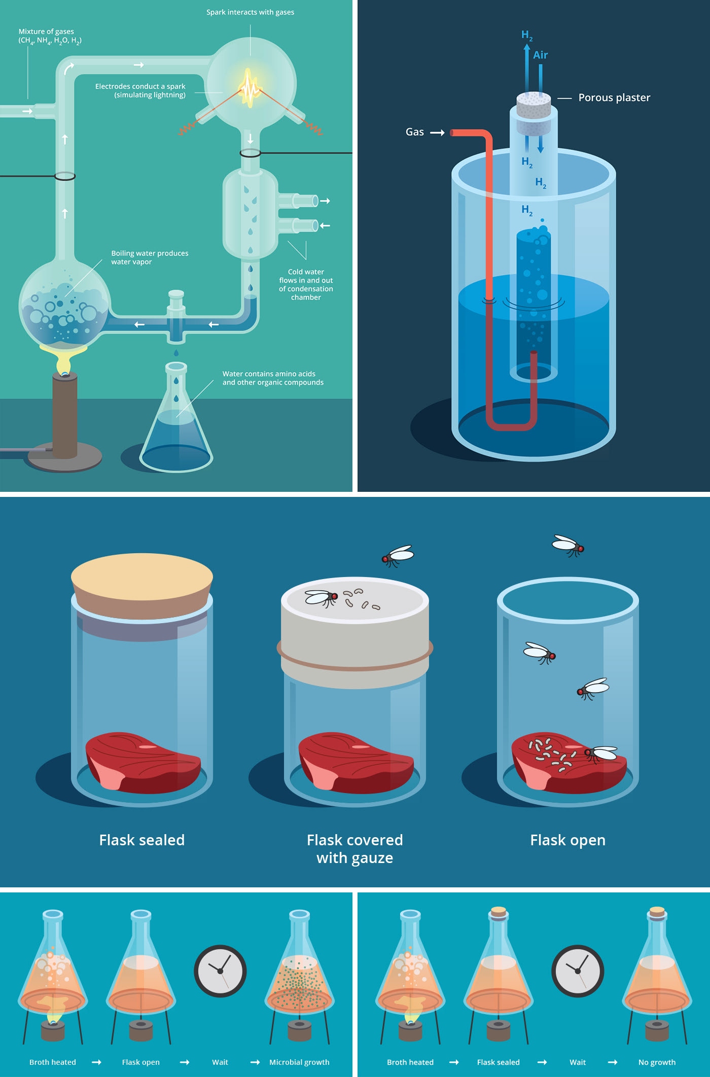
Illustrations of various scientific experiments
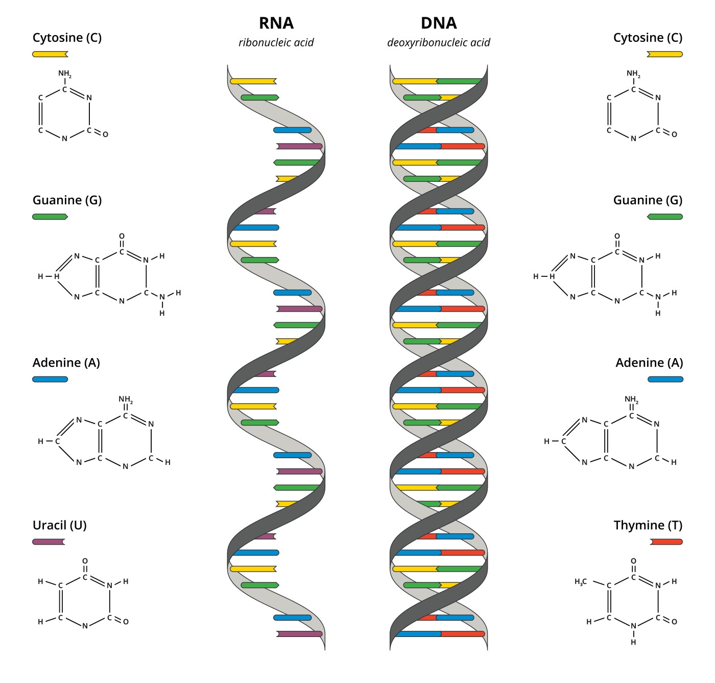
RNA and DNA structural composition
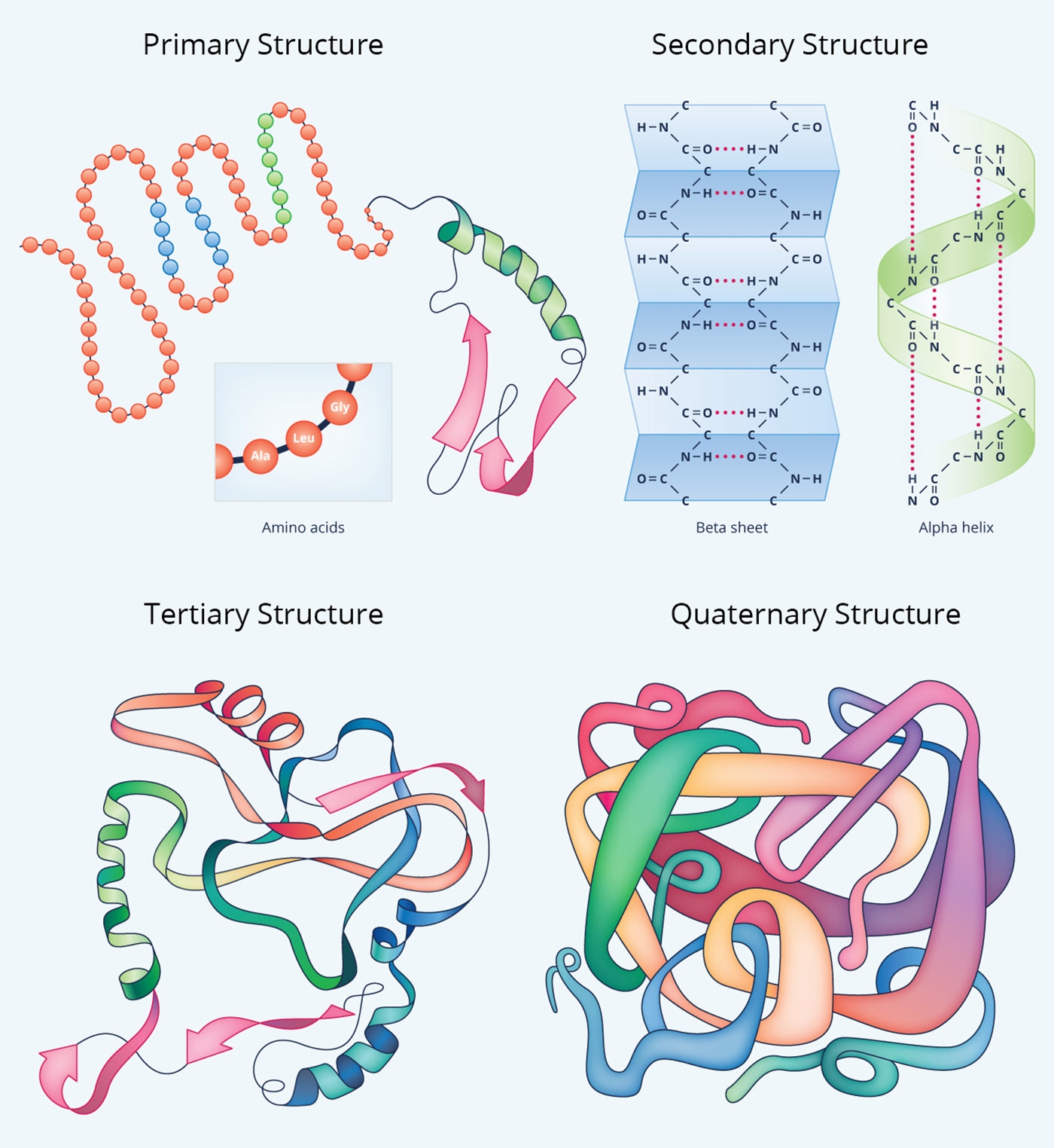
Four levels of protein structure
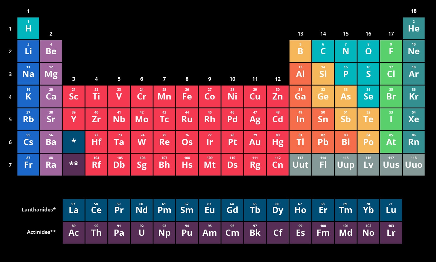
The Periodic Table of Elements
Results
Our work has enabled Visionlearning to continually develop new features and enhance the experience for both teachers and students. By staying ahead of the curve with growing accessibility needs and Next Generation Science Standards, we have ensured that Visionlearning remains a cutting-edge, reliable resource for STEM education.
